SnapCar UX Case Study
Project Overview
Car rental websites are highly competitive and require a seamless user experience to succeed. Additionally, the car rental industry is rapidly evolving, with new players and technologies constantly disrupting traditional business models. This presented as an exciting opportunity to explore and innovate in a dynamic and ever-changing landscape.
User Interview
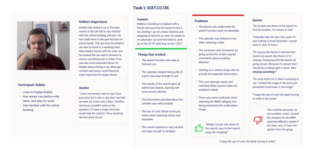
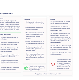
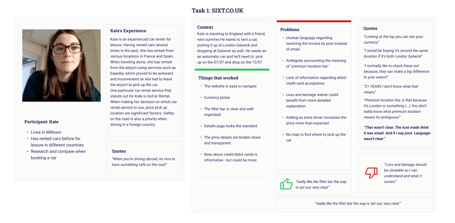
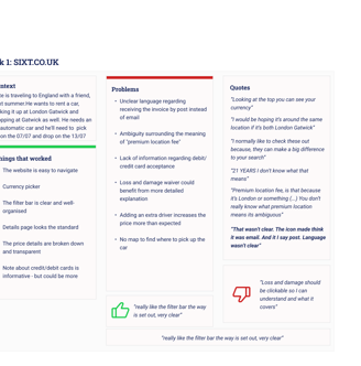
We interviewed participants from that had recently used car hire services or have used the services in the past year. We've done not only video interviews but also surveys to gather as much data as we could.
We've asked them to perform a set of tasks in two competitor's websites, from the search process until the payment and confirmation, and asked them to be as candid as possible about their experience.
Affinity Diagram
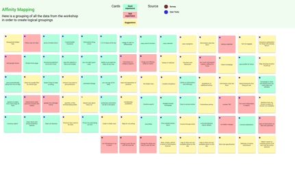
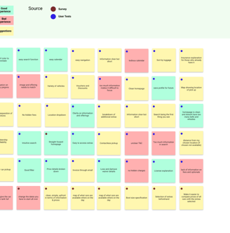
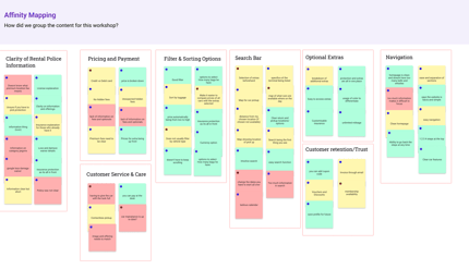
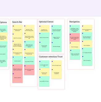
After gathering all the notes from the interview and the surveys, it was time to navigate through vast amounts of data and uncover the underlying insights. My goal was to distill this wealth of information into an affinity diagram that visually represents my accumulated knowledge. This diagram will serve as a valuable tool for future analysis and aid in making informed design decisions.
Customer Journey Map
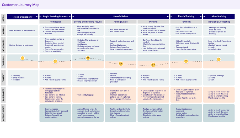
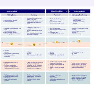
The Customer Journey Map is our guide through the user's experience. It reveals the highs and lows, pain points, and moments of delight in their interaction with our product or service. It's the storyteller of their journey, helping us understand their emotions and motivations.
Flow Diagram
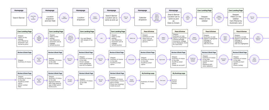
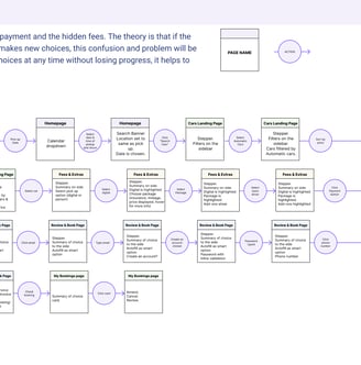
Based on previous research, the biggest pain point on the process was the payment and the hidden fees. The theory is that if the prices and optionals are being presented up front and updated as the user makes new choices, this confusion and problem will be reduced. Also, by adding a stepper, where the user can change any of the choices at any time without losing progress, it helps to diminish the friction.
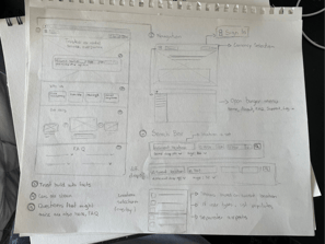
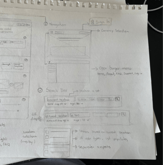
Sketches
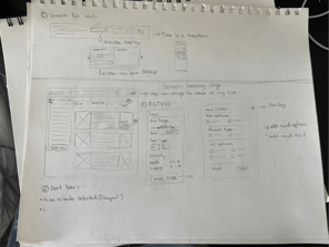
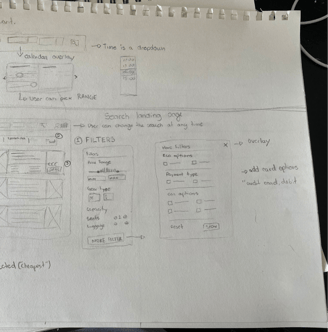
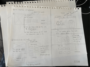
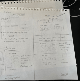
Proposed solutions
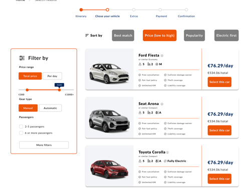
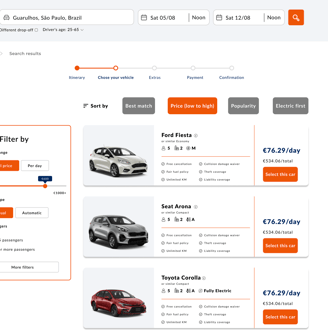
Reduced filter based on users feedback on filter importance
Sort by automatically set to low to high prices
Inline information about each aspect of the car, avoiding confusion and/or user having to go on google to understand the lingo
Progress bar, allowing them to go back at any time
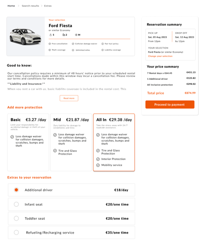
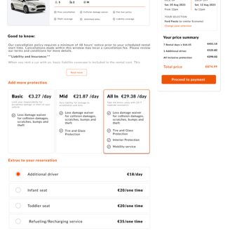
Price breakdown and reservation summary card
Automatically updated price breakdown when adding extras
All T&C included in the page before the payment
In line information for all bullet points and information given on the page
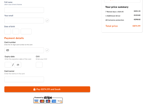
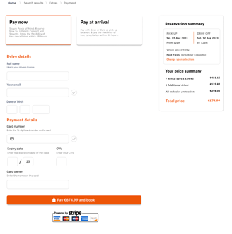
In line validation for all form fields
Price summary card present in all pages
Security validation at the payment button
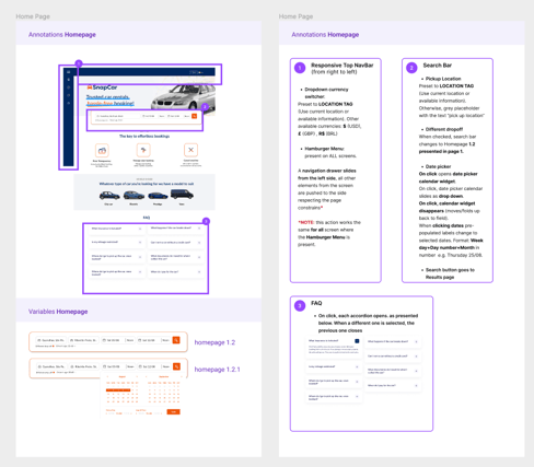
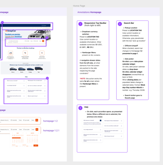
Components & Annotations
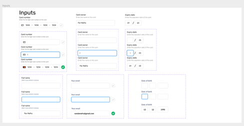
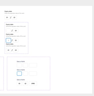
As a designer, I want to emphasize the significance of Figma components and annotations in our workflow. Components are our design superpower—they allow us to create consistent, reusable elements. They ensure that our buttons, icons, and more maintain a uniform look and feel, which is crucial for a polished final product. And for developers, components serve as a clear design blueprint, reducing guesswork and saving time.
Annotations, on the other hand, are our secret communication tool. They provide context, explanations, and interaction details that make a developer's job smoother. Annotations are like having a direct line to my design thinking, eliminating misunderstandings and back-and-forths.
